SCUTUM - ONE ECOSYSTEM, ONE EXPERIENCE
How do you unify a fragmented digital ecosystem without erasing what makes each region unique?
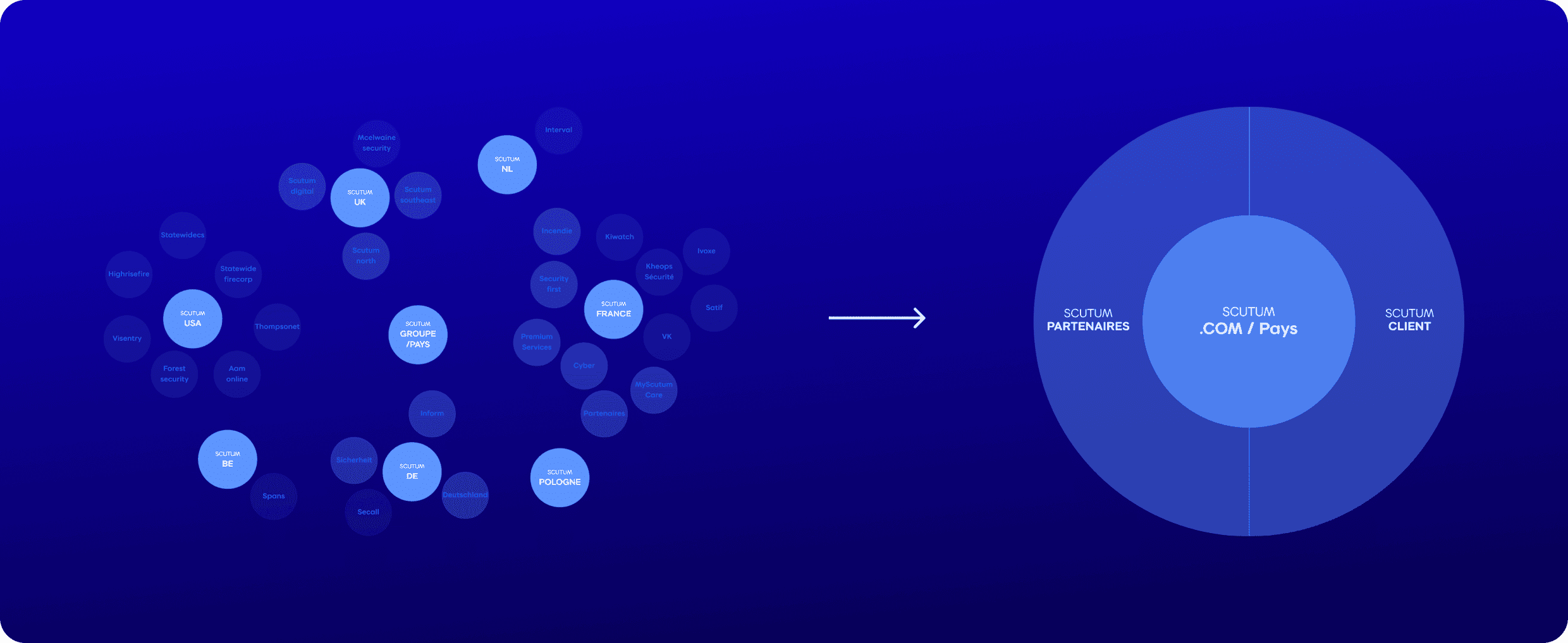
30 domains. 8 regions. One problem.
Scutum is an international B2B security group operating across Europe and beyond. But from the outside, you'd never know it, each region had its own website, its own sub-brands, its own way of presenting the offer. 30+ domains, no shared navigation, no coherent story. For a company selling trust and security, that fragmentation was a real liability.
Making "One Scutum" feel like
one experience
My role as UX Designer was to translate the 'One Scutum' digital strategy into a coherent user experience. I worked within a cross-functional team of project managers, developers and UI designers, leading the UX thinking from discovery through to handoff.
UX Strategy
Led vision, positioning, and roadmap from day one and defined core user flows and interaction patterns
Benchmark
Analyse direct and indirect competitors to identify best practices
Opportunity Mapping
Mapped the product landscape to identify highest-leverage opportunities
Design System
Built tokens, components, and principles from scratch
A wide range of ambitions, but focused on conversion
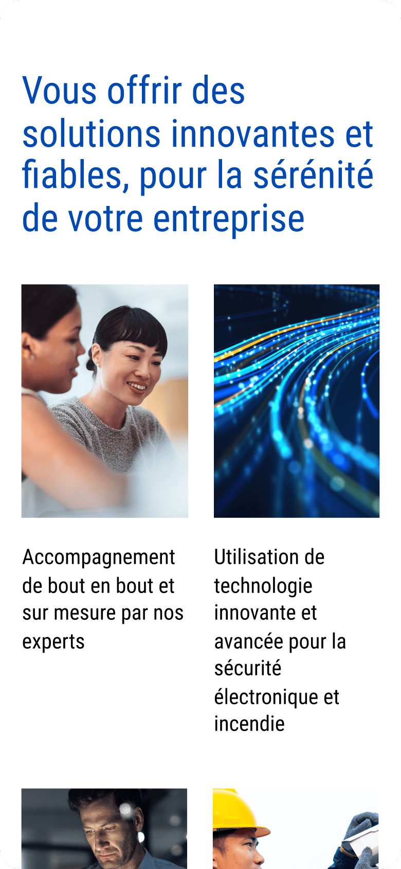
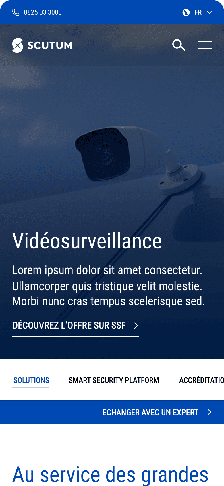
The project was structured around four strategic pillars: building a coherent brand architecture that scales, establishing Scutum's leadership through a clear and reassuring global offer, showcasing excellence through expertise and innovation, and ultimately driving conversion, from first contact to qualified lead. Every UX decision we made tied back to at least one of these ambitions.
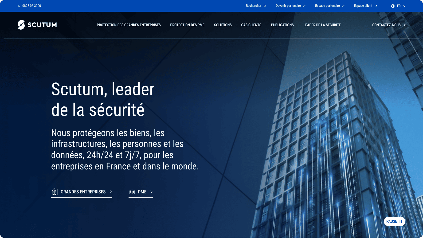
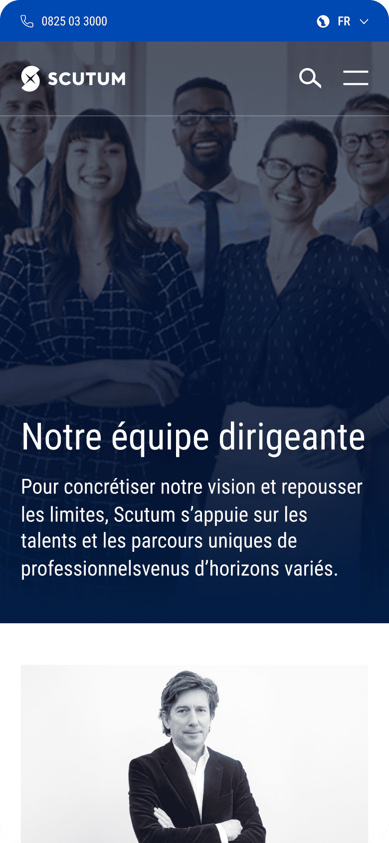
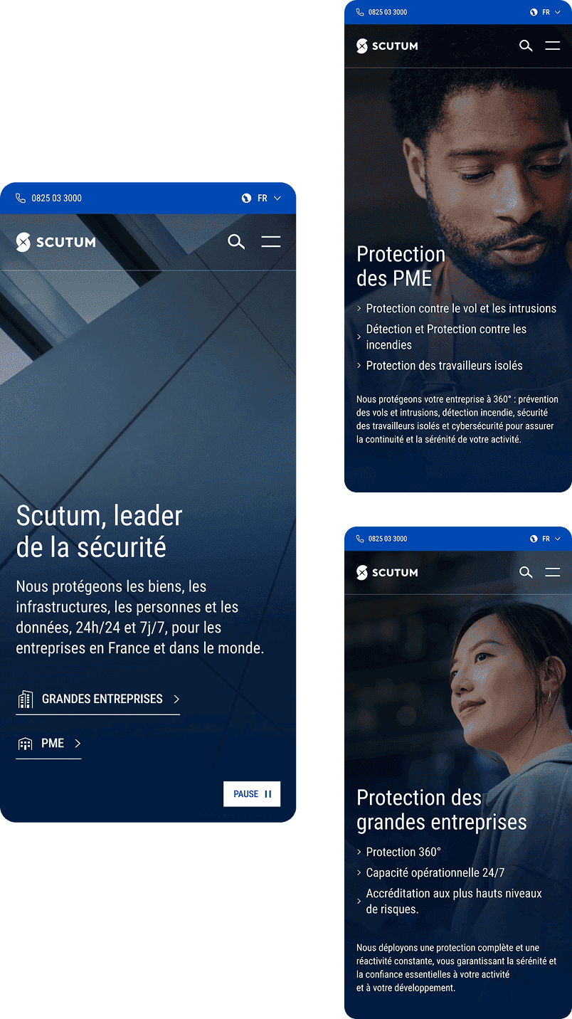
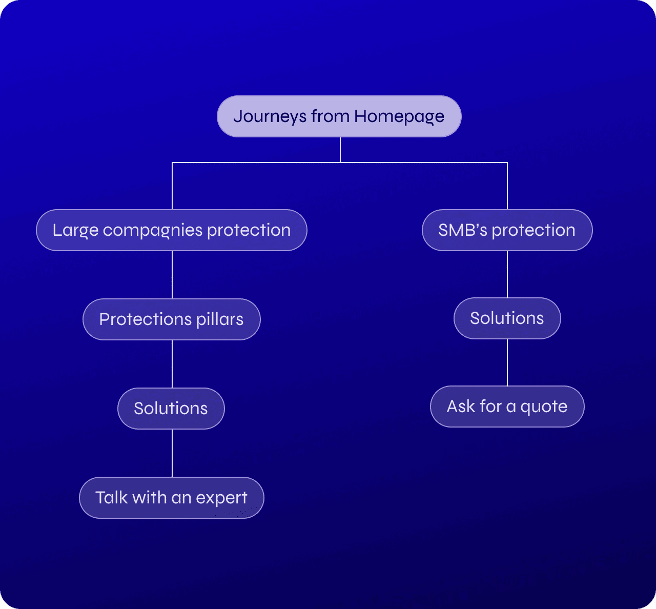
Two audiences, two paths
The most complex challenge wasn't unifying the visual identity, it was unifying two fundamentally different user journeys. Large enterprises and SMEs don't approach security the same way, don't need the same information, and don't respond to the same tone of voice. I designed two distinct paths through the site, making sure each audience could immediately find their way without the other getting in theirs.
Flexible enough to scale, structured enough to hold
One of the key tensions was between global coherence and local relevance. Some regions were worried about losing their identity (and rightfully so). The solution was a modular architecture: a shared global framework with up to 10% regional customisation. Enough flexibility to feel local, enough structure to feel like one company.

A lead signed two hours after launch!
The site went live after just over 5 months of work. Lead generation improved significantly, and the client confirmed the results. The most telling moment: a first lead was signed two hours after launch!
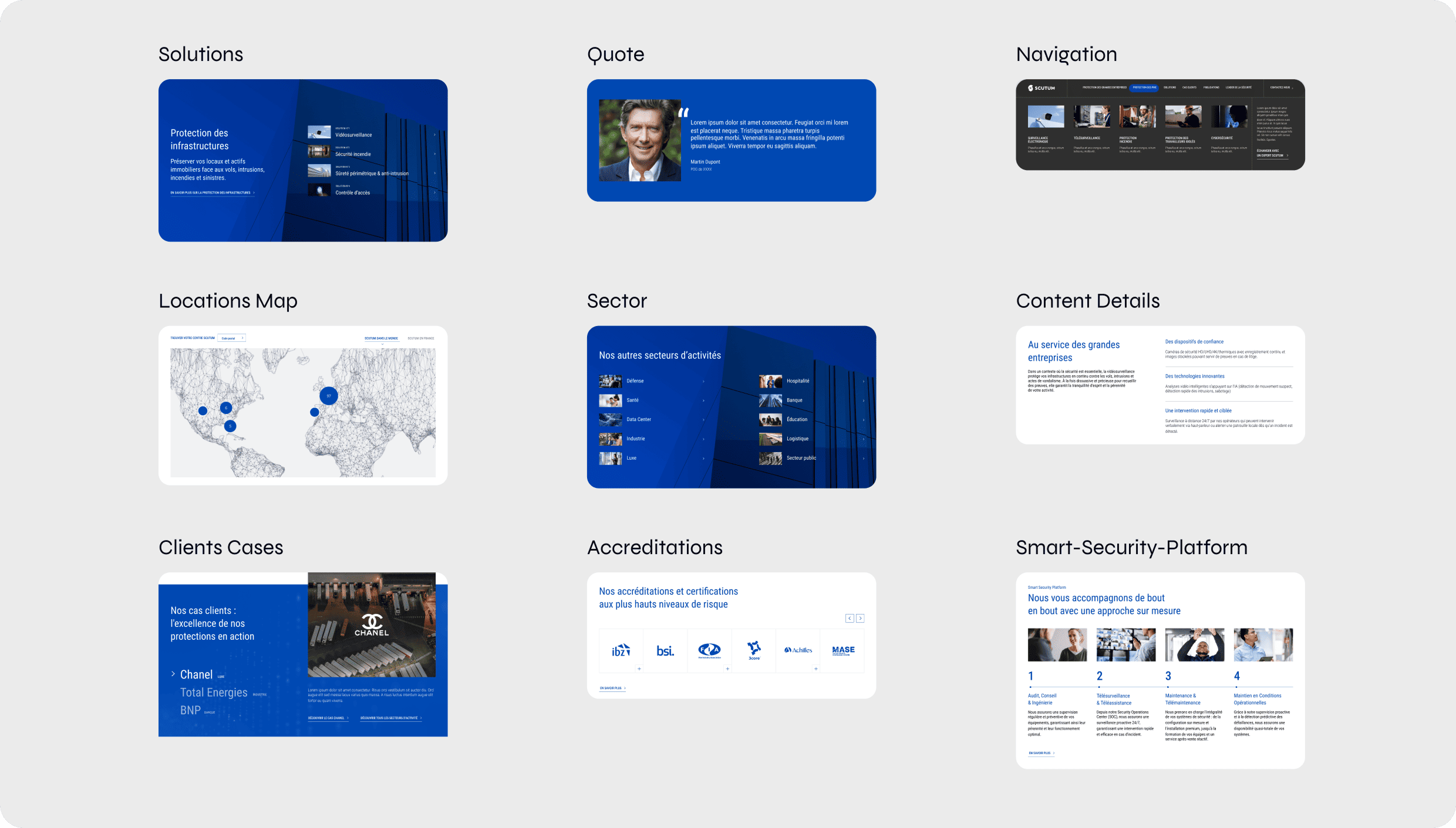
MVP-Ready platform
We deliver a comprehensive website designed around two distinct user flows to maximise conversion and deliver on the brand's promise
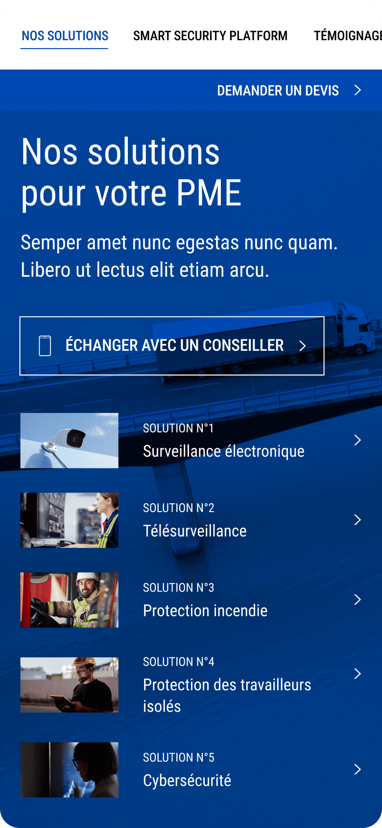
A flexible website
Over 30 complex components that enable modularity
If you’d like to hear more about full processes and the full story, I’d be happy to walk you through it.
Next Case Study
Happn
How to maximise the experience of our promise: “Find the people you cross paths with”?
Happn
How to maximise the experience of our promise: “Find the people you cross paths with”?